Cute Horror
I kept pushing toward a tone that feels uneasy and sympathetic at the same time, so the creatures read as vulnerable, uncanny, and worth rescuing.
Project
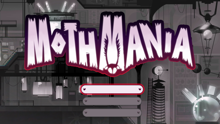
Moth Mania capstone puzzle platformerArt Bible And Concept Work
Moth Mania's cute-horror identity comes through cryptid folklore, readable silhouettes, and boards that kept the whole project visually coherent.
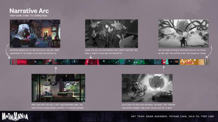
These graphics show the art bible, concept direction, character lineup work, and presentation boards that helped the team stay aligned on tone.
Style Goals
The look only works for me if it keeps the world eerie without making the play unreadable. I wanted the facility, the cryptids, and the UI to feel like they all came from the same strange place.
I kept pushing toward a tone that feels uneasy and sympathetic at the same time, so the creatures read as vulnerable, uncanny, and worth rescuing.
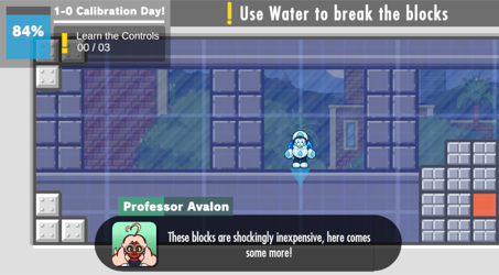
The shapes need to read fast because the systems depend on visibility, target priority, and quick recognition inside dark spaces.
The boards keep circling back to folklore, research-facility weirdness, and a kind of stylized Americana that makes the premise feel specific.
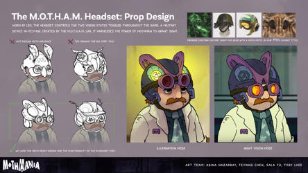
Art Bible
These spreads are the clearest snapshot of the art bible. They show the reference direction, mood, form language, and the broader visual rules that shaped the capstone presentation.
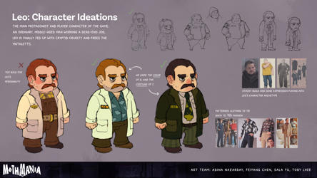
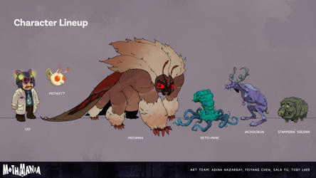

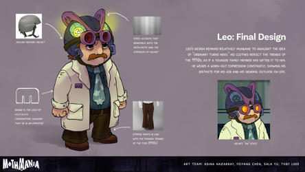
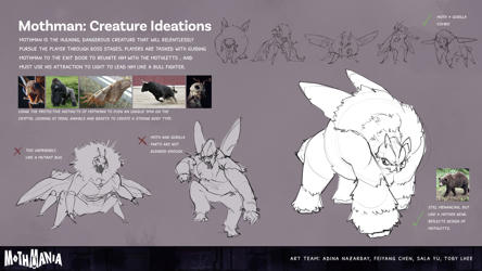
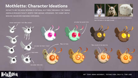
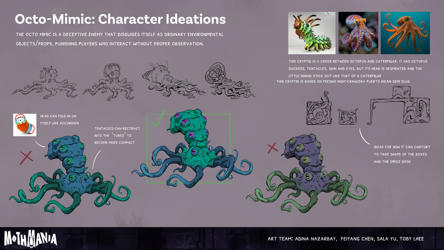
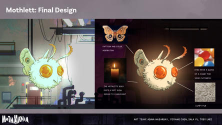
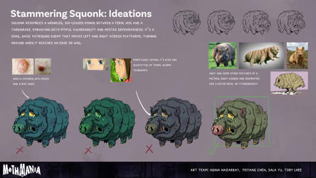
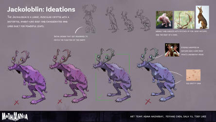
Concept Art
The lineup material shows how the cast, rescued creatures, and enemy roster were defined visually across the capstone.


Presentation Boards
I still wanted these on the art page because they show how the visual direction extended past pure concept art into the way the whole capstone was pitched and presented.